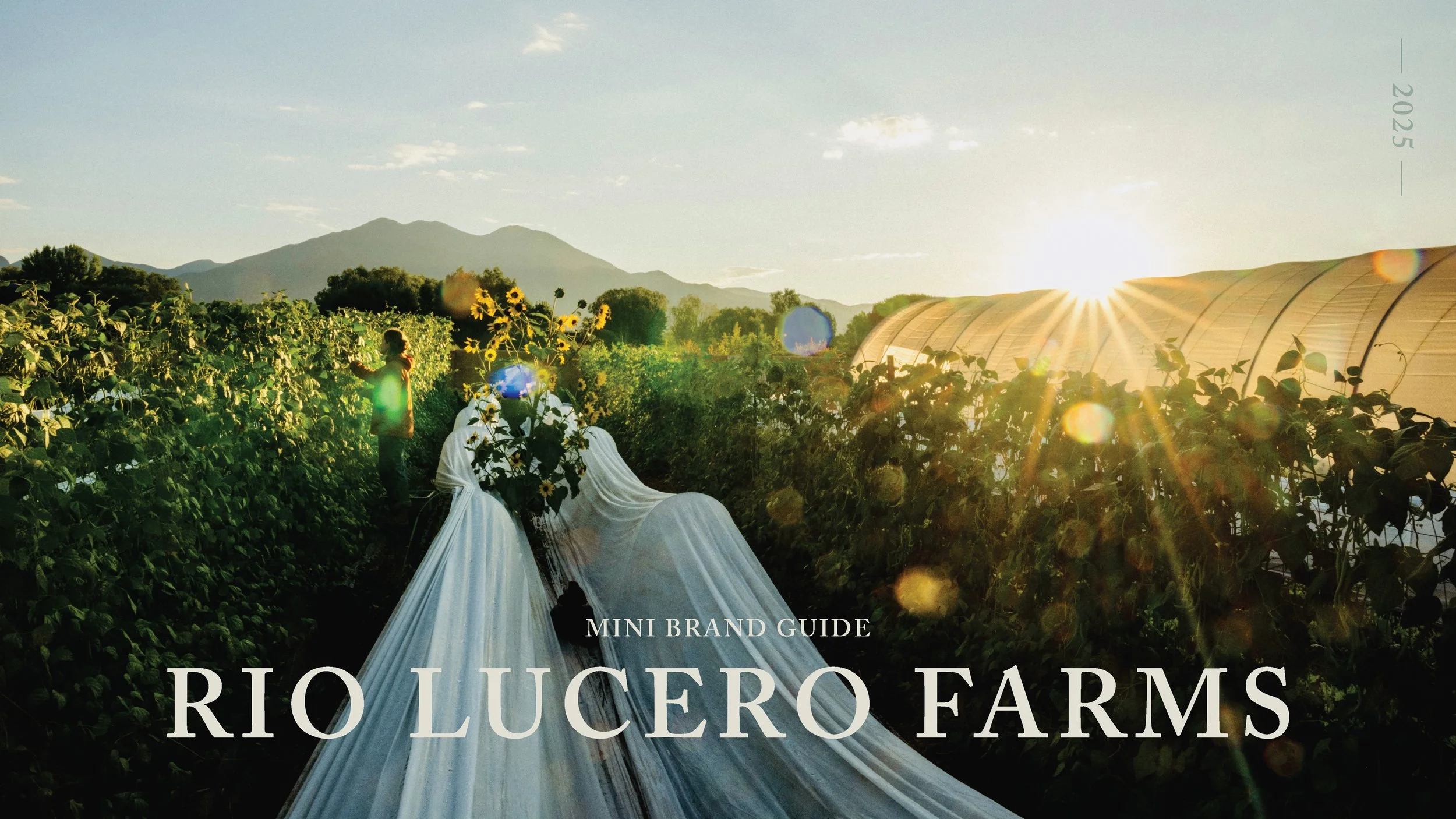
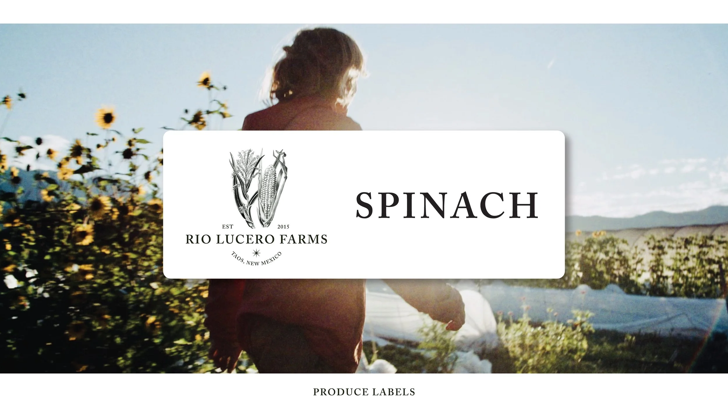
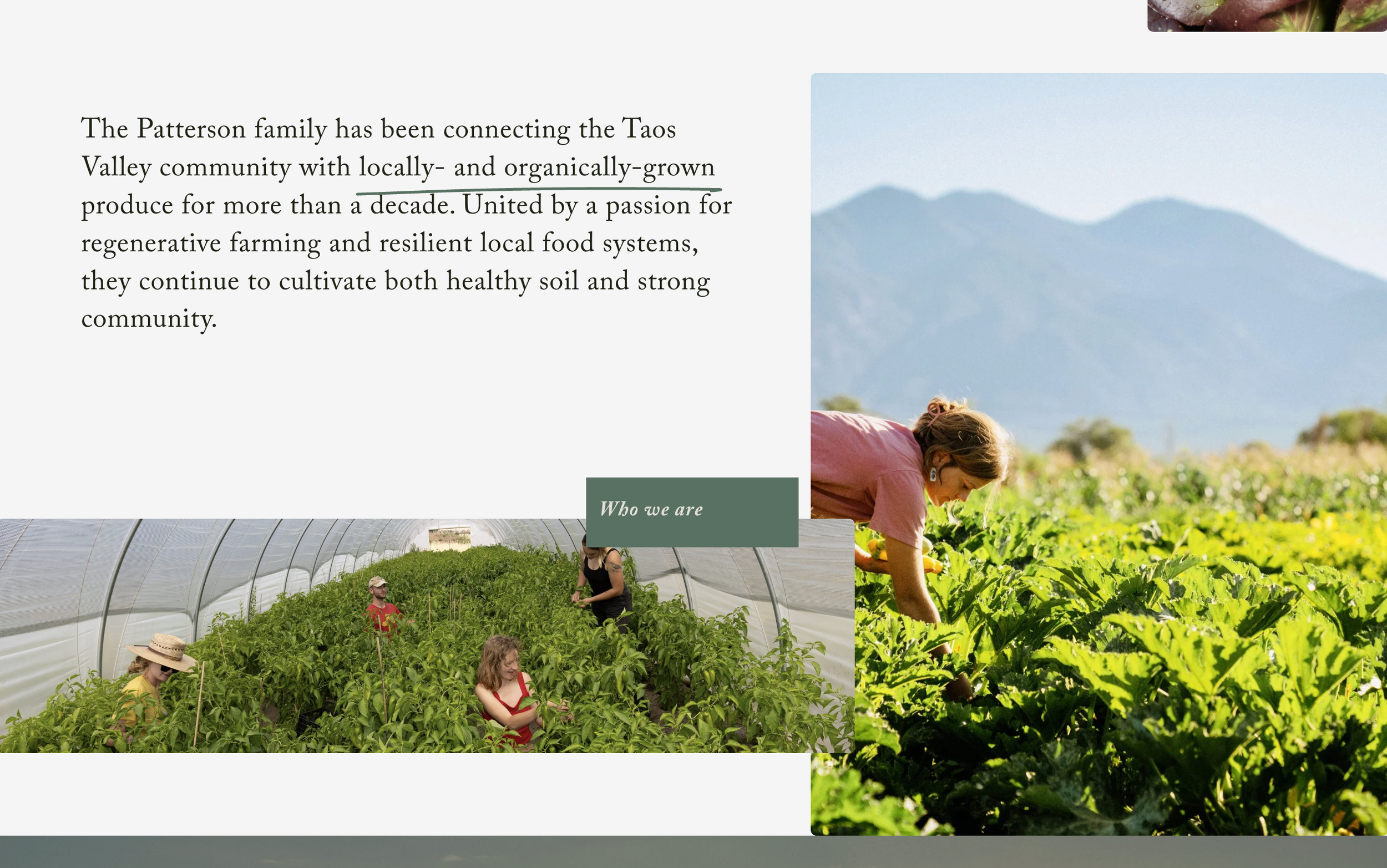
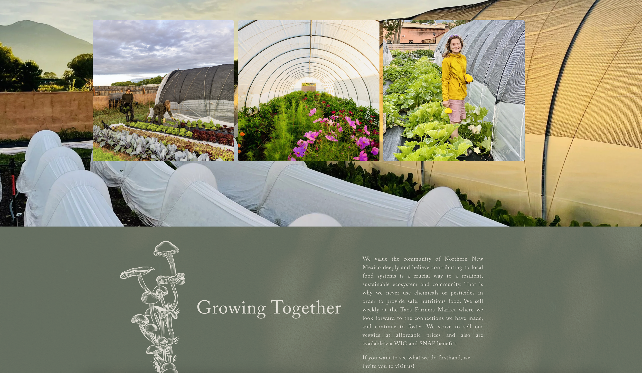
Brand Identity, Logo Refinement & Website Redesign
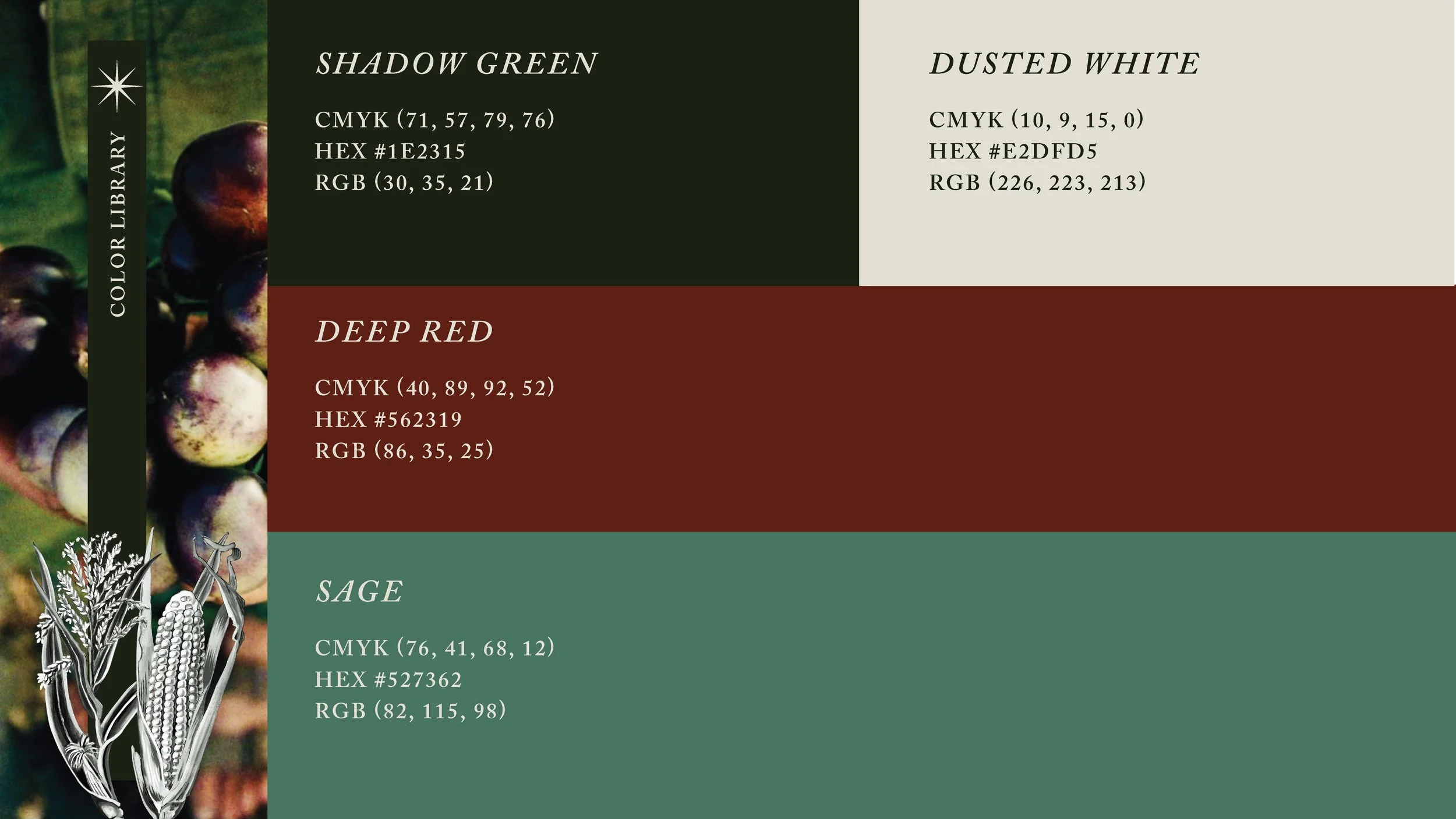
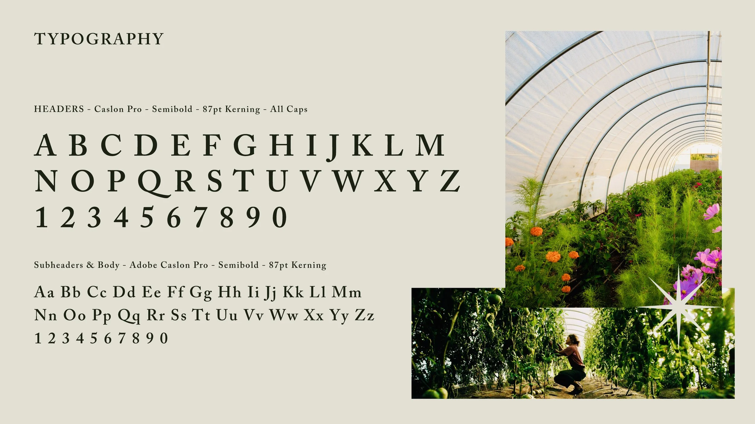
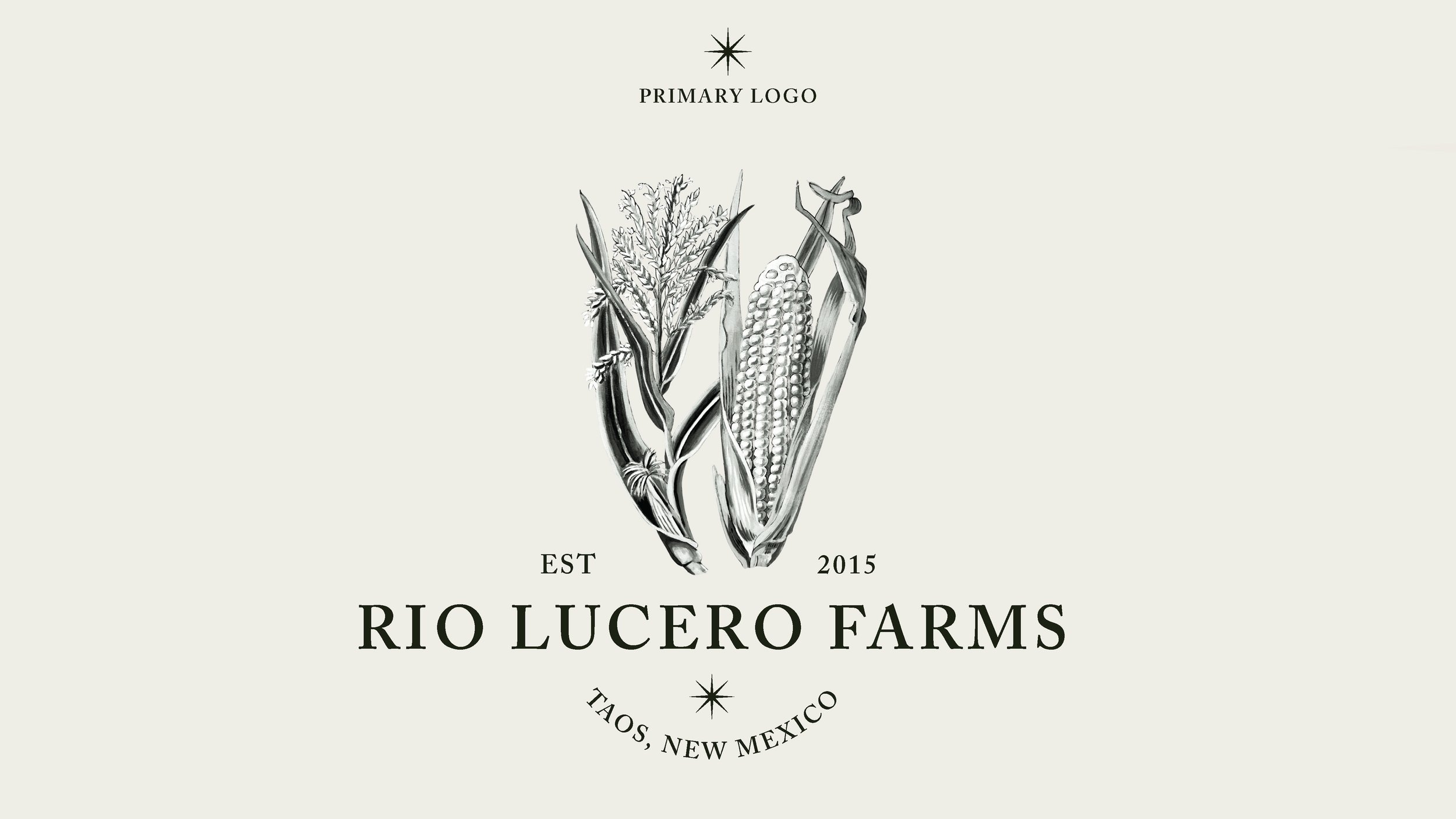
I collaborated with a local illustrator to develop the logo for Rio Lucero Farms, a regenerative, no-till organic farm rooted in the Taos watershed. Building from that foundation, I created a mini brand guide to define typography, color palette, and visual tone, reflecting the farm’s connection to land, community, and sustainability. I’m now applying this system to refine their website, bringing a cohesive, modern (farm) look that honors their high-desert identity and commitment to local food systems.

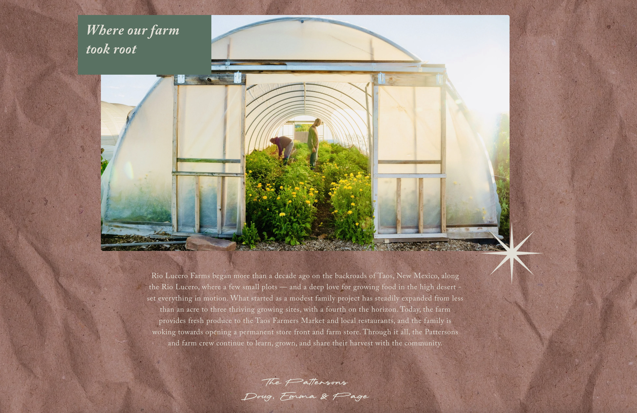
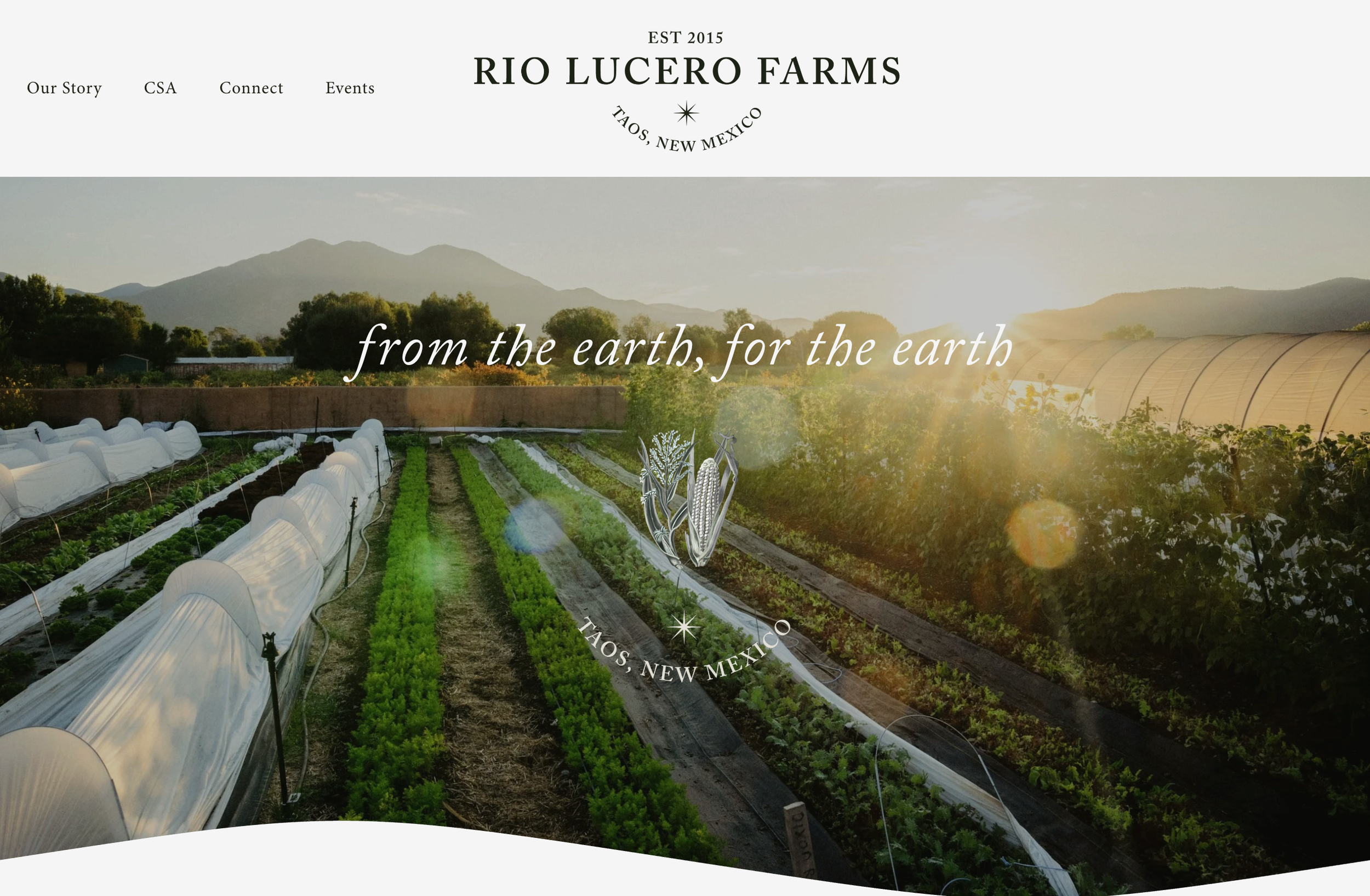
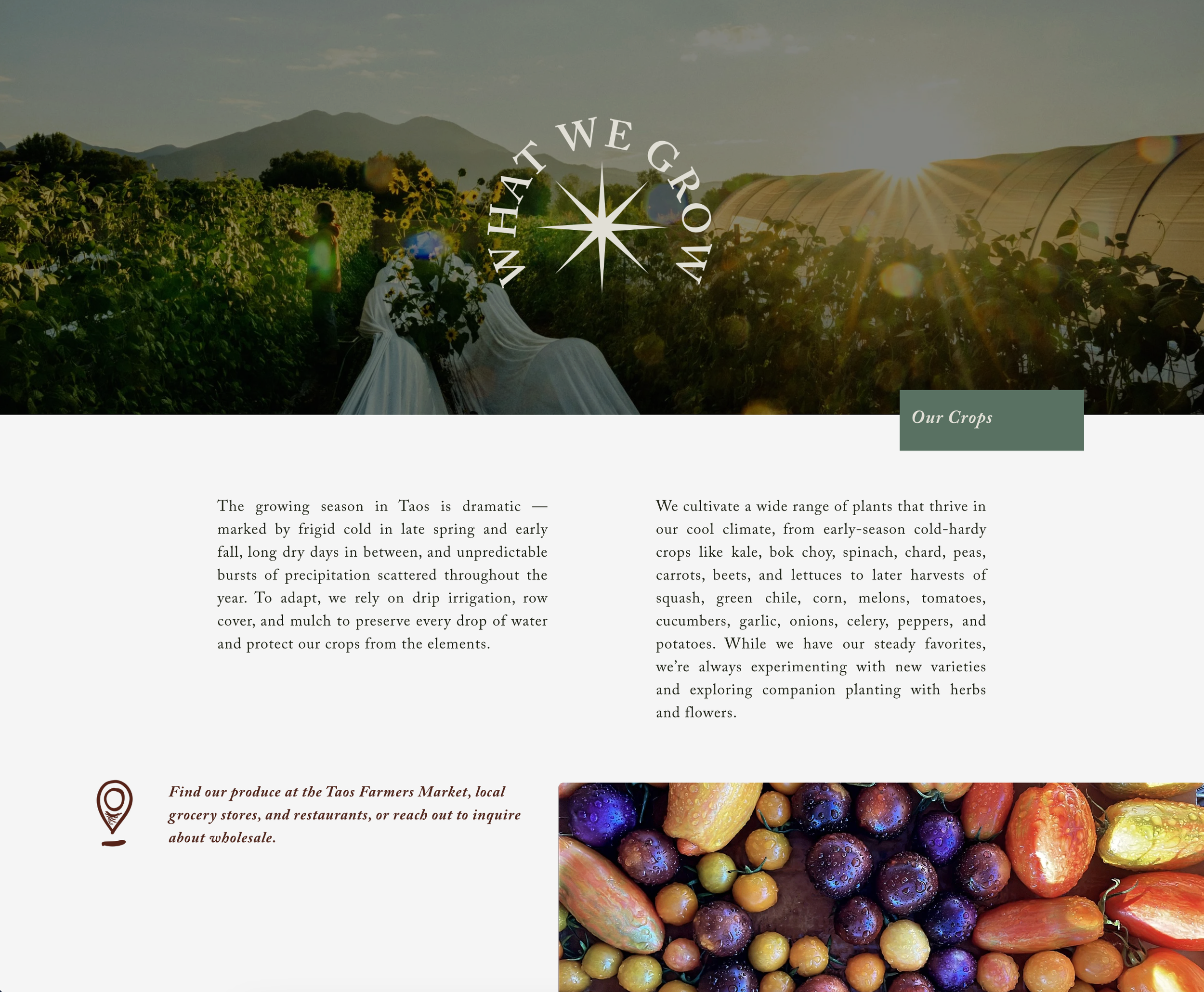

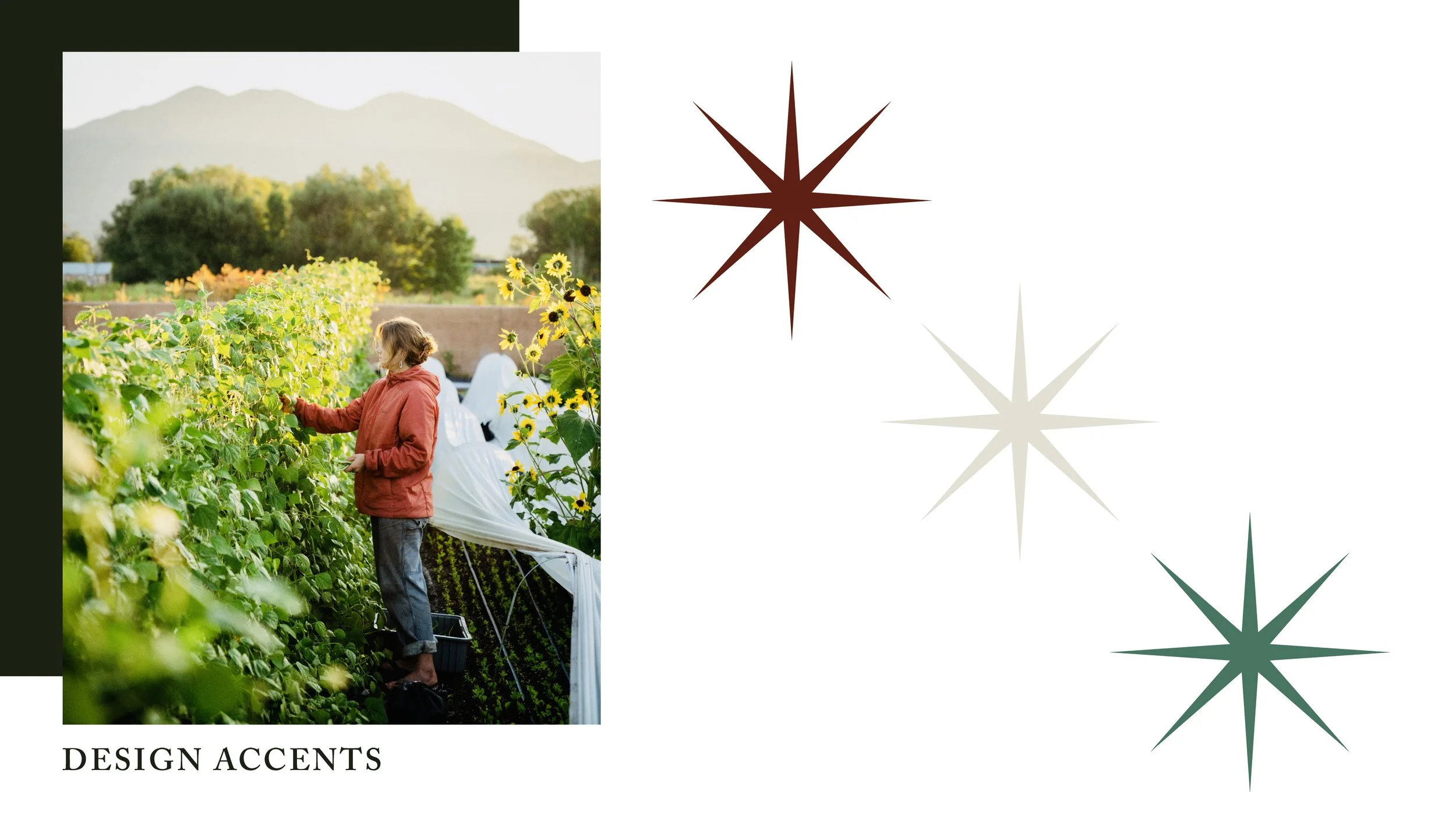
“Río Lucero” translates from Spanish to “Bright River” or “Star River.” The word lucero means “bright star” or “morning star”. To reflect that meaning, I incorporated a star symbol into the branding, representing the light that hits their farm year-round.